You Can Bet Your Sales Your Site Needs To Go Mobile
If your site isn’t mobile friendly, it might as well not exist. Seriously, if your site doesn't work well on a handheld, you're missing opportunities. How many? Well...
- More than half of all searches on Google come from a mobile device.
- 91% of mobile users say that access to content is very important. (Wolfgang Jaegel, 2015)
- Google says 61% of users are unlikely to return to a mobile site they had trouble accessing and 40% visit a competitor’s site instead. (MicKinsey & Company, 2014)
- 57% of users say they won’t recommend a business with a poorly designed mobile site. (CMS Report, 2015)
- 79% of people surveyed use their smartphone for reading email - a higher percentage than those who used it for making calls. (Email Monday, 2015)
- In April 2015, Google's Mobile Friendly initiative made whether your site was mobile friendly or not a major ranking signal.
Is Your Website Mobile-Friendly?
Open your website on your handheld - or better yet, ask someone who does not know your website to do this - and then ask the following.
- How fast do the pages load? If there’s even a brief wait, chances are you're losing customers.
- Is the content contained within the frame of your window? Is it too tiny to read without expanding it?
- Do the images get cropped or are so large you need to move them around to find the content? Do the videos display properly?
- Can you navigate easily around the site without pinching and resizing?
- Is the Menu easily found?
If any of these are an issue then…
Make Your Website Design Responsive
Simply put, a responsive website is one that displays your content in both a visually-appealing and clear way - no matter whether you open it on your desktop, tablet or phone.
Some primary ways to make your site responsive are:
- Responsive Grid. This allows your content to reflow with the size and orientation of the device or browser window. A popular one is Bootstrap, developed by Twitter.
- Fluid Images and Elastic Videos. By coding your images to display in relative units (instead of absolute pixel sizes), these will size accordingly - and load faster. Videos, likewise, can also be made responsive, but make sure the aspect ratio remains intact. Here's a good tutorial on how to make your videos elastic or fluid.
- Media Queries. First introduced in CSS3, these will change the display of your content dependent on certain conditions, such as screen width. There are numerous media queries. Which one is right for you? Check out this overview.
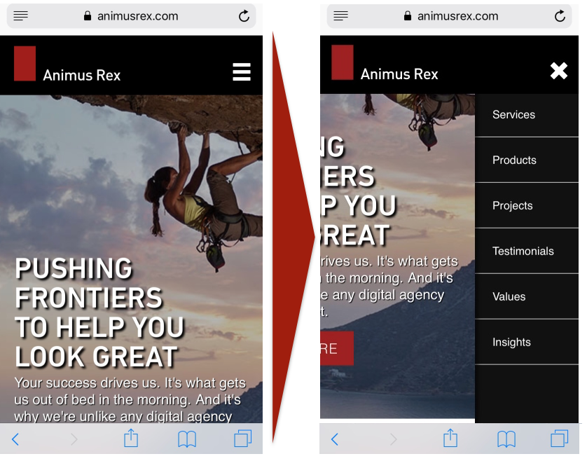
- Sticky Dropdown Menus. As shown below, a sticky dropdown menu is a great space-saver that will always be accessible at the top of your screen and will expand vertically to allow easy navigation of your site.

Creating a New Website?
Lucky You! You can make your site mobile-friendly right from the start. Just remember to start small, then grow. The idea here is that it is easier to expand your content into a larger space than to figure out ways of making it smaller.
So remember:
- A Mobile-friendly site is customer-friendly.
- Design responsive means meeting your customers on their devices.
- Your customers are not going mobile, they went mobile years ago.
Here's to your successful website!